Readability born in noise, cold and urgency
Before becoming an aesthetic code, oversized numerals, sharp hands, clear contrasts, the readability of pilot’s watches is a vital necessity. In a vintage cockpit, you don’t look at the time: you catch it with your eyes. Motor vibration, thick gloves, variable light, stress, altitude, condensation… The watch is not a piece of jewelry but an instrument. And when navigation depends on heading calculation or fuel timing, wasting a second deciphering a dial can be costly.
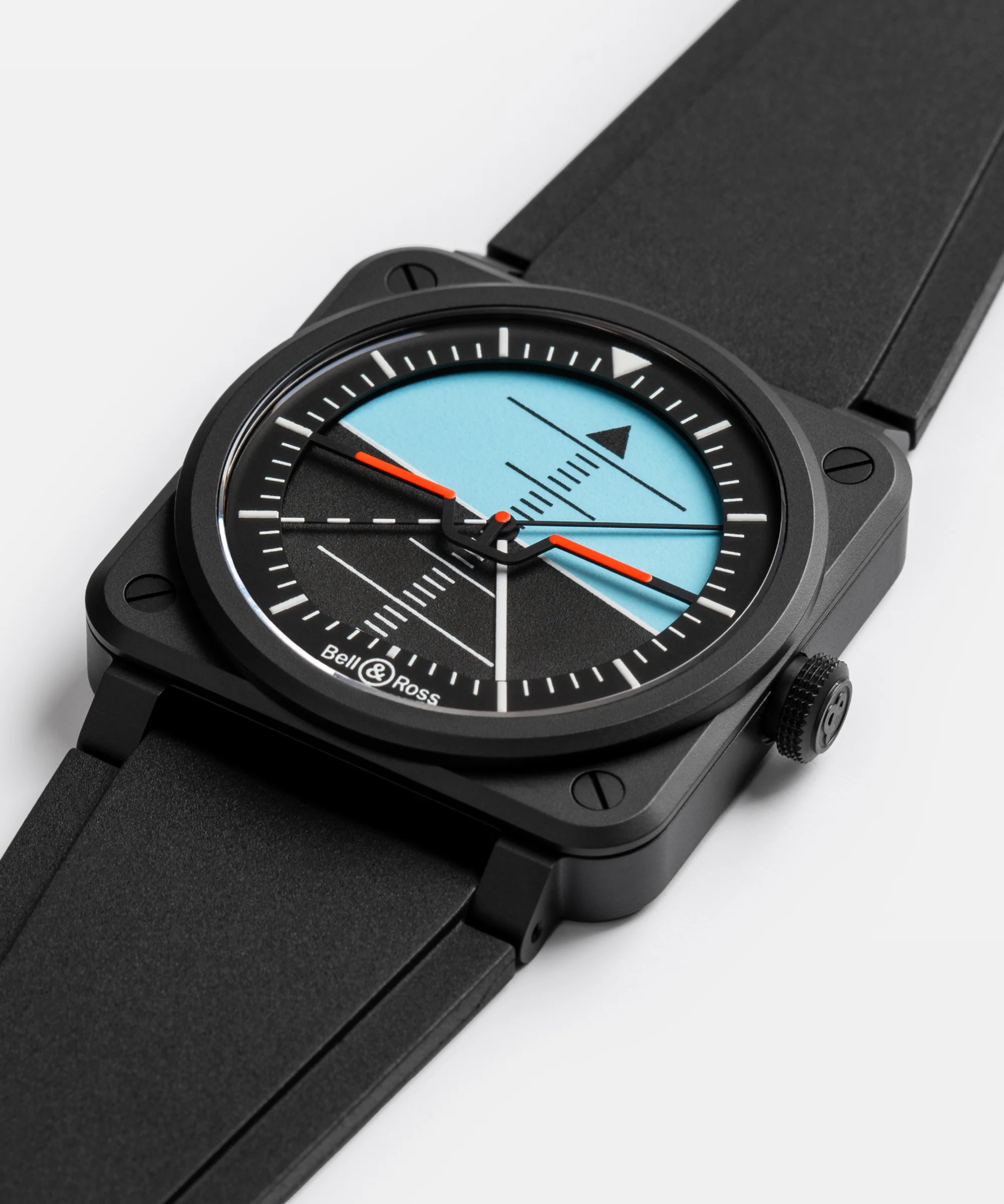
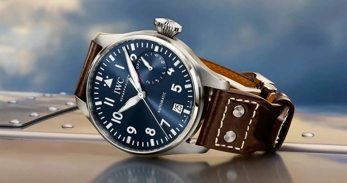
This founding idea explains why pilot’s watches have developed, more than all other watchmaking families, a graphic language of the obvious. A successful pilot dial reads like a road sign: immediately, directly, unambiguously. This is a type of watch that is sorely lacking in my collection, I am strongly considering treating myself to one soon.
The mission of a pilot dial: information before ornament
We often associate readability with the simple black/white contrast. In reality, it is organized around a hierarchy of information. On a traditional pilot’s watch, the eye must distinguish in a fraction of a second:
- the hours (overall reading, hand position),
- the minutes (navigation precision, fine marks),
- the seconds (control, synchronization, timing).
This hierarchy explains almost immutable design choices: large and contrasting hands, simple indexes, unadorned typography, clear peripheral minute track, and, very often, a deliberate absence of decorative details. Where a dress watch can allow reflections, a guilloché texture or a sophisticated flange, the pilot’s watch favors immediate reading.
The origins: when aviation learned to read time
The first aviator watches: time on the wrist, finally
In the early days of aviation, we flew with rudimentary instruments. The pocket watch, impractical in flight, quickly gives way to the wrist: it is more accessible and can be consulted at a glance. Very early on, we understood that ergonomics took priority. Clear dials, large numerals, marked hands: the DNA is in place.

The test of real conditions
Readability becomes an obsession as soon as we put together the constraints of flight: low light, reflections on the canopy, sudden movements, masks and glasses, then gloves and suits. A dial that is too bright or too busy becomes unreadable. Brands are therefore moving towards matte finishes, strong contrasts, and markers that “snap” visually.
The turning point in standards: readability as an obligation
German B-Uhrs: codified readability
The absolute reference, in the watchmaking imagination, remains the Beobachtungsuhr (B-Uhr), these large 55mm observation watches produced during the Second World War according to strict specifications. Here, readability is no longer a quality: it is a standard.

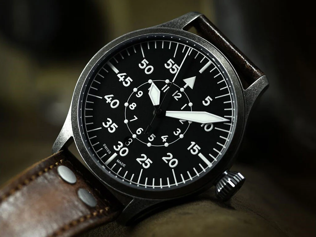
Two large dials “Type A” and “Type B” appear. Type A favors the hours (1 to 11) with a triangle at 12, while Type B puts the minutes in the foreground (5-55 large scale) and relegates the hours to an inner ring. For what ? Because when it comes to navigation, it’s often the minute that counts. This logic of visual priority, minutes first, is a lesson in functional design that watchmaking continues to cite.
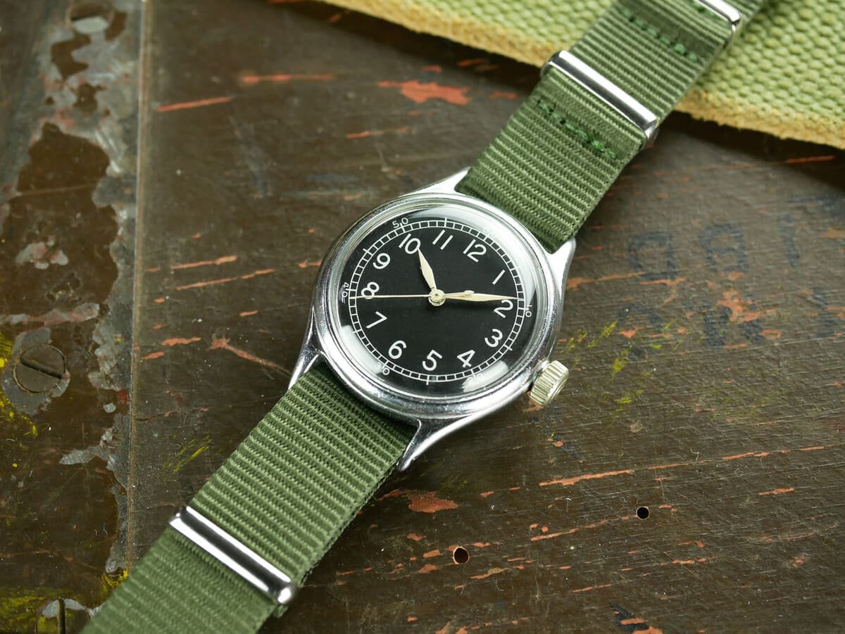
RAF, A-11 and other allied standards: the tool above all
On the ally side, the philosophy is similar: robust watches, stripped-down dials, simple typographies, and a strong presence of luminescent material. Certain specifications impose readability, precision and maintenance constraints. Result: an austere style, but terribly effective and, today, become iconic.

The technical ingredients of a “readable” dial

1) Contrast: matte black, crisp white, and nothing in between
Most classic pilot’s watches are based on a winning combination: black dial (often matte) and white or cream markings. Matt limits reflections, black accentuates the reading of the hands and indexes. Some models invert (clear dial, black numbers), but the objective remains the same: maximize the luminance differential.
2) Typography: a utility font, designed for the moment
Arabic numerals dominate because they are read faster than indexes alone, especially when looking for a precise time. A “tool” typography avoids full and thin lines, overly thin serifs and stylistic effects. Pilot’s watches popularized this watchmaking alphabet without decoration, close to signage: the eye recognizes the shapes even before “reading”.
3) Hands: more important than numbers
A dial can be perfect: if the hands merge with the background, everything falls apart. Pilot’s watches therefore rely on large hands, often of the “sword”, “stick”, or “syringe” type, with a generous luminescent surface. The shape also serves to instantly distinguish hours and minutes. And on many models, the second hand is thin but equipped with a marker (luminescent dot, triangle, “lollipop”) to be visible when moving.
4) The peripheral timer: the precision ring
The flange or minute track is the pilot’s discreet tool. It allows you to read precisely to the minute, sometimes to the half-minute. This peripheral graduation acts like a ruler: the minute hand clearly “points” there. It is also a way of limiting the bulk of the center of the dial, where the essentials take place.
5) Luminescent material: reading the time when the light disappears
Luminescence, first with radium, then with tritium, and today mainly with Super-LumiNova, is a pillar of readability. It transforms the watch into a nocturnal instrument. But here again, readability is not just a question of “shining brightly”: sufficient surfaces are required, good distribution (hands and indexes), and a daytime color that does not overwhelm the contrast.
Why this style still fascinates us: the aesthetics of function

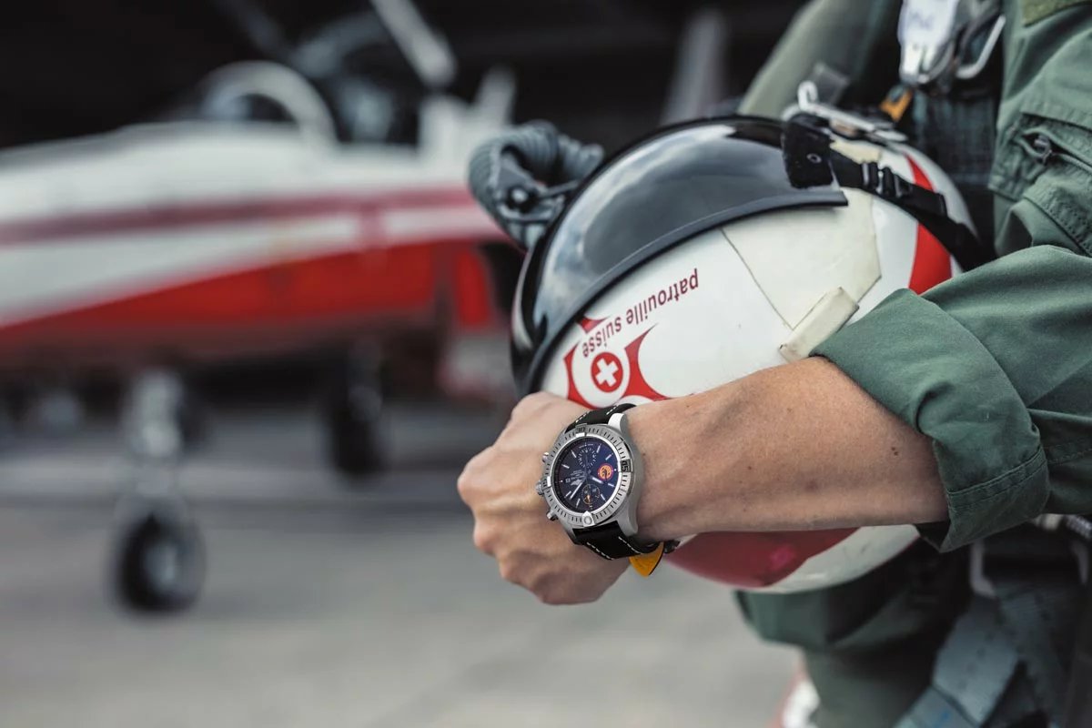
Pilot’s watches have a particular cultural power: they tell of a time when watchmaking was a direct ally of exploration. The legible dial is the visible vestige of a world of maps, headings, mental calculations and quick decisions. Wearing a pilot’s watch today often has nothing to do with aviation; it is a way of embracing an idea: that of the honest instrument, made to serve.
And paradoxically, this paring down has created one of the most identifiable styles in watchmaking. A good pilot’s watch can be recognized from three meters away, like a silhouette. It’s industrial design that has become heritage.
Modern compromises: when marketing tries to confuse the reading

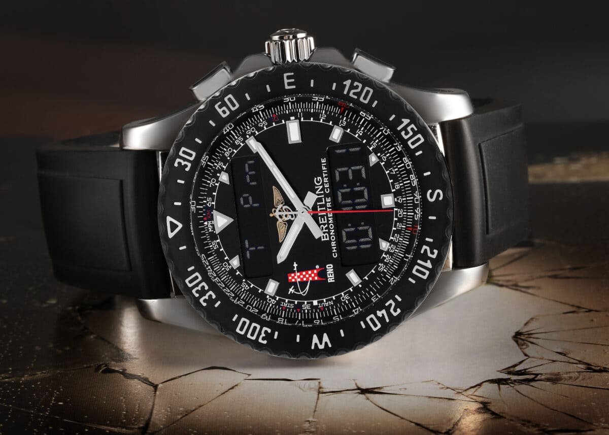
As the pilot’s watch has become an object of style, certain models have accumulated complications, textures, logos and colors. The risk? Break the balance. Too much information, and the visual hierarchy disappears.
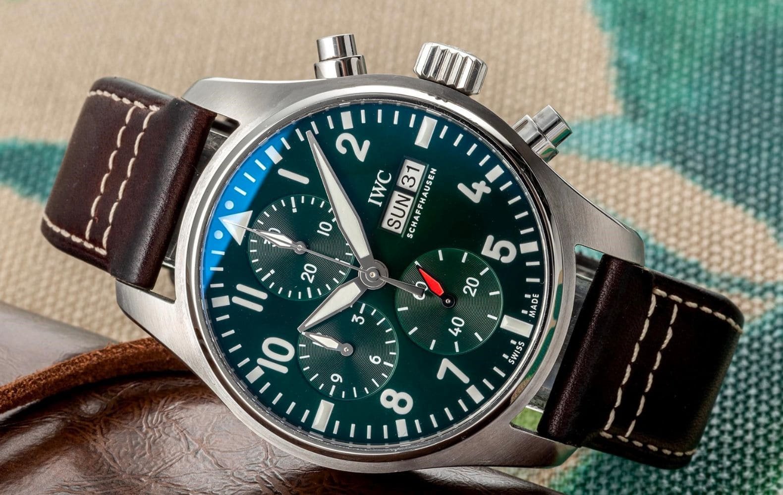
The best contemporary interpretations remain faithful to the essential: readability, simplicity, coherence. A pilot’s chrono can remain very readable, provided that the counters are well sized, contrasted, and that the main hands maintain priority. Good design is not opposed to complexity; he organizes it.
- Immediate contrast : matte background, clear inscriptions, hands that come off.
- Clear hierarchy : minutes and hours readable at first glance, seconds visible without effort.
- Sober typography : simple numbers, sufficient size, airy spacing.
- Accurate timer : useful, aligned, non-decorative graduations.
- Functional light : indexes and hands that can really be used in the dark.
Basically, a successful pilot’s watch is a visual “yes”
Why do pilot watches have such readable dials? Because they were born from a context where time was not a comfort, but a navigation parameter. And because a good dial, in aviation as elsewhere, is not one that is admired: it is one that is understood.
In a world saturated with signals, the aesthetic of pilot’s watches continues to appeal for a very contemporary reason: it does not negotiate with the essential. She affirms, with the sobriety of well-designed objects, that information must be clear… especially when it matters.