In the world of watchmaking, everything seems to be a matter of details. A crown too wide, a case too thick, a poorly balanced dial, and the alchemy disappears. Among these often debated elements, the choice of indexes, Arabic numerals, Roman numerals or simple sticks, seems trivial. He is not. The question of readability runs through the entire history of watches, and in this game, Arabic numerals remain one step ahead, not through a form of aesthetic snobbery, but for profoundly technical, cognitive and cultural reasons.
Instant, effortless reading
Checking the time should be a reflex, not an exercise. Arabic numerals, those we use every day, offer immediate reading. They are integrated from childhood, associated with powerful automatisms. The brain does not translate, it recognizes.
This is the difference with Roman numerals or minimalist indexes. When faced with an “IV” or a simple stick at four o’clock, a microsecond of decoding is necessary. Tiny, but real. And in watchmaking, this fraction of a second counts. Readability is not just a convenience, it is a function.
Pilot’s watches understood this very early. From the 1930s, German Type A and Type B dials, the famous Beobachtungsuhren, adopted large, contrasting Arabic numerals, often associated with a clear peripheral minute track. Telling the time at a glance, in a dimly lit cockpit, was not a stylish design.
The decisive role of typography
Not all Arabic numerals are equal. Their readability is as much due to their presence as to their design. Well-executed typography plays on the openness of the shapes, the thickness of the lines, and above all the contrast with the dial.
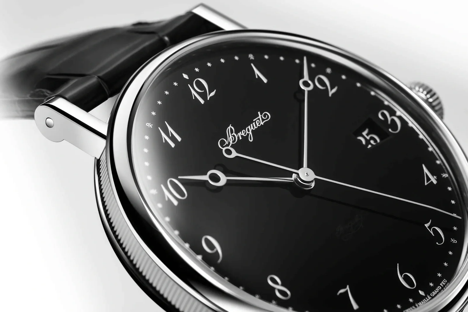
Take the numbers “3”, “6”, “8” or “9”. Badly drawn, they become confusing. Too stylized, they interfere with reading. The major watchmaking houses know this, and some have developed their own typographic signature. Breguet, for example, elevated the Arabic numeral to the status of an art object with his famous “hollowed apple” numerals, curved, almost calligraphic, while remaining surprisingly legible.

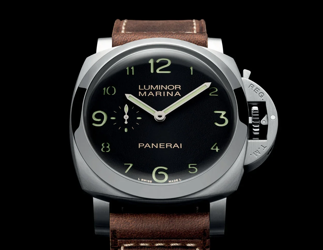
In contrast, Panerai relies on massive numerals, cut out of sandwich dials, where the luminescent material is flush. Here, the readability is raw, almost military. No superfluous elegance, just efficiency. Two philosophies, same result.

Contrast, dimension, hierarchy
Readability depends not only on the type of index, but also on their interaction with the rest of the dial. Arabic numerals offer a structural advantage, they take up more space and allow information to be visually organized.
A dial with Arabic numerals creates strong markers at each hour. This facilitates peripheral reading, which is used without really looking at the watch. Conversely, very thin stick indexes can disappear in certain light conditions, or on textured dials.
The visual hierarchy is also clearer. On a tool watch, the main numbers can be reinforced by a secondary timer, a railway track, or luminescent markers. This structuring makes the watch “readable from an angle”, a quality rarely mentioned but essential in real life.
Luminescence and nighttime use
In the dark, the debate is even more decided. Arabic numerals make it possible to integrate a larger and more homogeneous luminescent surface than simple indexes.

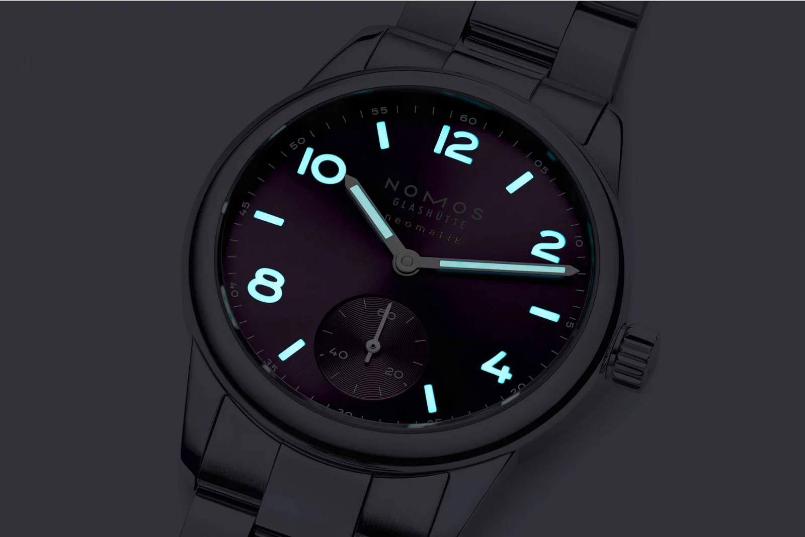
Super-LumiNova, tritium in the past, or even radioactive paints in the less careful past, all these materials become more effective when they fill solid shapes. A glowing “12” is more identifiable than a double stick. It gives immediate orientation of the dial, essential in the dark.
This is also why many military watches, from the British Dirty Dozen to contemporary field watches, still favor Arabic numerals today.
A decisive advantage for certain complications
When the watch becomes more complex, readability becomes a challenge. Chronographs, complete dates, world times, all these complications multiply information in a small space.
The Arabic numerals anchor the gaze. On a chronograph, for example, well-spaced numbers make it easier to read the time and counters simultaneously. They serve as fixed points in an otherwise saturated dial.
Conversely, Roman numerals can become visually overwhelming, especially with their stretched shapes. Try integrating an “VIII” neatly into an already busy dial. Good luck.
A question of usage above all
To say that Arabic numerals are “better” would be simplistic. Let’s say they are more suited to a watch designed as an instrument. Where function takes precedence over form, they are a natural fit.


But watchmaking is not just about functionality. A watch with Roman numerals, whether it comes from Cartier or Vacheron Constantin, offers something else. A certain idea of time, more classic, more ornamental. Less rushed, too.
The stick indexes are almost abstract. They purify, they modernize, sometimes to the point of total erasure. Magnificent on a minimalist dress watch, but rarely the champions of readability.
Why Arabic numerals remain an obvious choice
Basically, the superiority of Arabic numerals rests on a rare balance. They are universal, intuitive and adaptable. They accommodate very different styles, from military vintage to contemporary luxury, without ever losing their readability.
They interact well with needles, whether sword, syringe or dauphine. They structure the dial without weighing it down. And above all, they respond to the primary function of a watch, to tell the time, immediately.
It is no coincidence that, despite fashions and experiments, they always come back. A watch can be a piece of jewelry, a work of art, a statement. But when checking the time, often without thinking about it, it is the Arabic numerals that we read the fastest.