A color that captures the light and the eyes
All it takes is a low ray in the late afternoon to understand the appeal of a watch with a champagne dial. The record comes to life, oscillates between straw and honey, then dies away in a dull sweetness. It’s a lively shade — less flashy than polished gold, more refined than cold silver — that charms without forcing. At a time when elegance wants to be discreet, this color becomes the secret language of discerning wrists.
The origins of charm: from the “gilt” to the golden years
The champagne dial has its roots in the great tradition of galvanized gold dials and “gilt” markings from the 1940s to the 1960s. At the time, gold and steel were already rubbing shoulders, and the idea of a warm disc, less white than silver, was essential on dress pieces as well as on versatile city watches. Later, in the 70s and 80s, two-tone (steel/gold) popularized a solar and urban aesthetic: a nod to hedonism, which resurfaces today with a new maturity.
Fashion is cyclical, of course, but the return of the champagne dial goes beyond nostalgia. It responds to the desire for tactile, sensory luxury, where we perceive the material, the depth and the possible patina. Many collectors appreciate it for the way it evolves: a champagne can seem lighter in the office, more amber in the sun, almost sandy in the evening. A changing watch is already a conversation.
Current trend: retro-luxury in a “quiet” version
Why now?
Several currents converge:
- The return of reasonable sizes and sober silhouettes, which favor nuance over ostentation.
- The vogue for warm palettes in men’s and women’s fashion: beige, tobacco, ecru, linen, which interact naturally with champagne.
- The quest for versatile pieces capable of going from jeans to suits without a false note.
- A renewed interest in the watchmaking culture of the 60s and 70s, a period rich in sunbrushed dials, faceted indexes and golden markings.
Technically, what are we talking about?
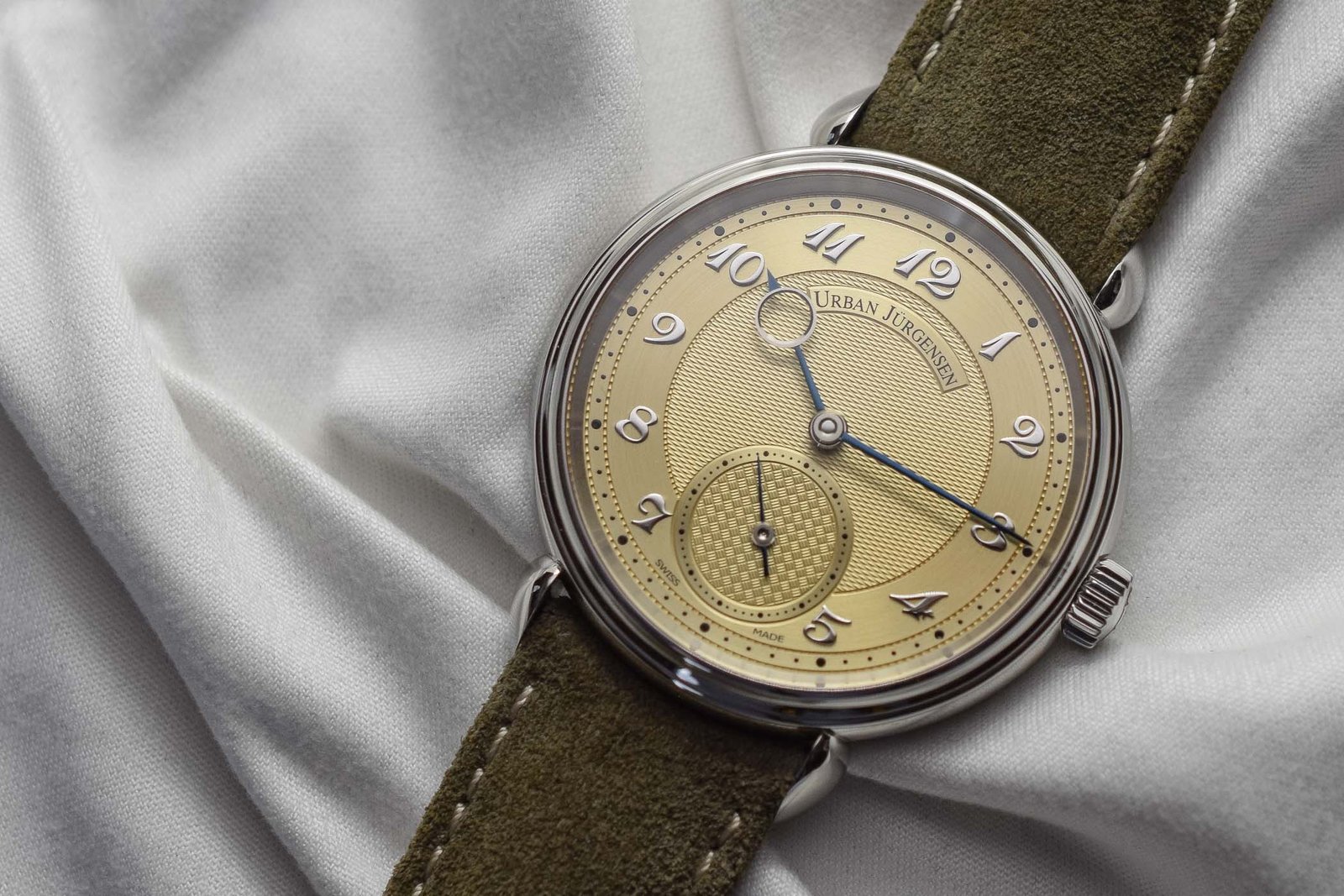
Champagne is not a single color, but a family of tones obtained by different processes. We come across pale gold galvanized dials, sunbrushed finishes that stretch the light, sometimes warm lacquers or slightly opalescent varnishes. Some opt for “gilt” marking – gold text and timer placed before the base coat – offering rare chromatic coherence. The applied indexes (batons, dauphine facets, Arabic numerals) then play with punctual flashes, reinforcing readability without breaking the harmony.
The real secret? Light management. Champagne enhances the micro-architectures: index chamfers, relief of the flange, ribs of a “sunburst”. A quality detail is immediately visible: regular brushing, clear typography, a gold tone that tends neither too yellow nor too pink. When the balance is right, the whole thing breathes.
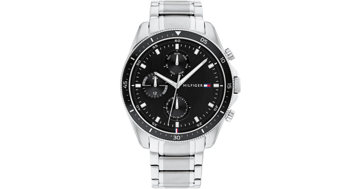
Steel, gold, or two-tone?
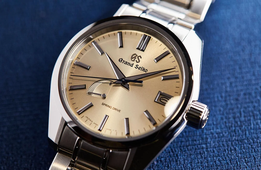
Steel with champagne dial is the most modern combination: it tempers the heat of the disc with the coolness of the metal, perfect for everyday life. In yellow gold, we assume dressed, almost ceremonial elegance. The two-tone, long shunned, returns with aplomb: more graphic, very seventies, it works wonderfully with a wardrobe inspired by Italian tailoring.
Bracelets and textures
- Tobacco, cognac or honey leathers: prolong the softness of the dial without saturating it.
- Gray or taupe suede: contemporary option, less expected, very chic on steel.
- Brown alligator: the formal way, ideal in a dark suit.
- “Grains of rice” or jubilee steel bracelet: retro accent, complementary play of reflections.
Sizes and proportions
Champagne lends itself to contained diameters – 34 to 39 mm – which highlight the light of the dial rather than the presence of the case. Short lugs, a thin flange and decent anti-glare further enhance this impression of quiet sophistication. On fair skin as well as on tanned skin, the shade will flatter the wrist: it warms up cool complexions and prolongs golden complexions.
Three profiles, the same temptation
- Contemporary minimalist: fine steel case, matt champagne dial, three hands, gray suede strap. Guaranteed “art gallery” look.
- The vintage esthete: dauphine indexes, curved hesalite glass, fine typographies. An air of a city from the sixties that has not aged.
- A fan of two-tone: fluted bezel, alternating polished/brushed bracelet, sunburst champagne. The Riviera spirit brought up to date.

Express buying guide: the enthusiast’s eye
- Dial Finish: Look for even brushing, crisp prints, even tint without greenish reflections.
- Harmony of the elements: hands and indexes must interact with the color (golden, rhodium-plated, or well-chosen two-tone).
- Real light: check the watch outdoors and indoors; the champagne changes greatly depending on the lighting.
- Versatility: Ask yourself if the watch matches your neutrals (beige, gray, navy). This is the litmus test.
- Case metal: steel for everyday wear, gold for dressy, two-tone if you like character.
- Movement and size: a fine automatic in 36-38 mm is an excellent balance point between tradition and comfort.
- Maintenance: prefer easily replaceable bracelets; a simple taupe leather can transform the whole look.
Why champagne dial watches are trendy
Because they embody exactly what enthusiasts are looking for today: presence without ostentation, culture without tension, and that indefinable charm that only beautiful objects exude. A champagne dial is not a fleeting fad; it is a shade that tells a story of know-how, light and the passing of time. It fits the trend, of course, but above all it goes beyond it — like a good vintage that we rediscover with each sip.
On the wrist, the watch then becomes more than an instrument: an invitation to nuance. And perhaps that is true modernity.