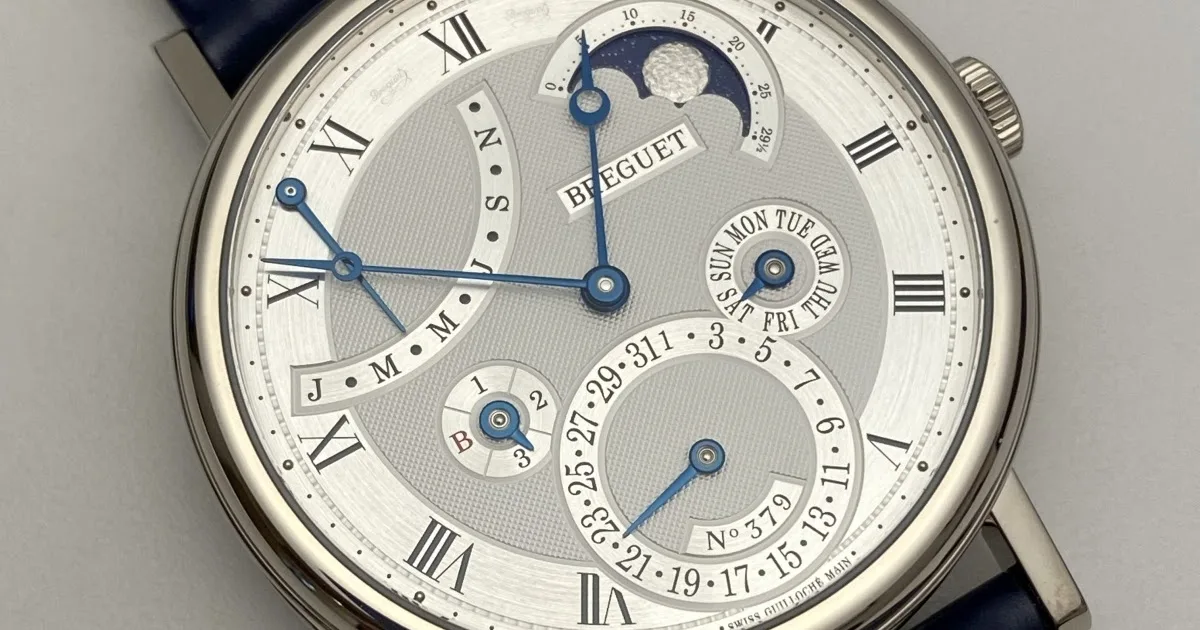
One of my favorite Breguet Classique watches is the reference 5327 Perpetual Calendar. I have always appreciated this watch, although I am not generally a big fan of calendar watches because I found the presentation of the dial to be original and breaking the usual codes of complication. To tell the truth, when one discovers for the first time the dial of the Breguet 5327, one finds that there reigns a hell of a mess. The dates are indicated by a hand in a circular sector at 6 o’clock and are located around the top of the date scale on 3 small displays, like bubbles, dedicated to the months, days of the week and years. The arc on the left is used to indicate the power reserve and the moon phase display is on the right, facing inwards.
The Breguet Classique Perpetual Calendar 7327:
Its predecessor, the Breguet Classique Perpetual Calendar 5327:

It turns out that Breguet has just presented a new version of this Classique Perpetual Calendar under the reference 7327. The Breguet 7327 is very interesting to analyze because it perfectly summarizes the new aesthetic orientation of the manufacture as glimpsed with certain recent novelties. If this approach had to be summed up in two words, it would be: modernization and efficiency.
Modernization because Breguet’s clear desire was to eliminate the details that gave an old-fashioned charm to the previous version. Admittedly, the elements of style remain: the case with a fluted middle, the apple hands, the straight lugs, the dominating guillochage and the characteristic hour ring. However, Breguet has aired out the dial by using the arc of a circle for the month display, eliminating a small display, enlarging the date sector and orienting the moon phases outwards. The graduations are larger, more readable, the style is more refined and the guillochage is henceforth uniform whereas several motifs cohabited on the dial of the Breguet 5327. Likewise the interpretation of the moon is much more contemporary, bye-bye the face of the Moon and the clouds and welcome to a more realistic and monochromatic Moon. Being closer to the bezel, it also becomes more visible.
The baroque decoration of the movement of the 5327 version:

The more sober decoration of the 7327 version:

Efficiency because the main objective assigned to the Breguet 7327 is to improve the readability of calendar data and in particular of the most important element for a Perpetual Calendar: the dates. On this point, the success is total. Thanks to the expansion of the sector, information is much more easily accessible. The whole thing breathes better and the dial seems more orderly while retaining a touch of originality.
On the movement side, the aesthetic approach was the same. The 5327 and 7327 versions are driven by the same caliber 502.3 with a frequency of 3hz and a power reserve of 45 hours. And yet, here too, what an evolution between the two references! The baroque and sophisticated decoration, a bit demonstrative of the caliber of the 5327, gives way to an interpretation that is just as neat but much more sober. The specific architecture of the movement is now more perceptible and the decoration is consistent with the interpretation of the dial… as was already the case with the 5327. The difference in visual impact is such that one can even imagine that it is more profitable to decorate the movement of the 7327 than that of the 5327. In other words, cost control is not an argument to be excluded even if, I repeat, the visual rendering of the movement of the 7327 is flawless.
The dates are more readable on the dial of the 7327 version:


So, are these changes any good? To be honest, I’m having trouble answering this question. It is clear that Breguet wants to make the watches in the Classique collection more in tune with today’s tastes through a more airy and sober style and more legible displays. For my part, I somewhat regret the abandonment of the “old school” interpretation of the 5327. Even if one could find the finish of the movement too luxuriant, this excessive side was not to displease me. After all, when buying a watch in this price range, the irrational dimension wins out. And the 5327 version with its cluttered dial and its movement decorated like a Christmas tree really appealed to me. Fortunately, Breguet has retained a large part of its strengths through the 7327, including in particular the contained diameter of the case (39mm). In the end, it’s all a matter of taste. The quality of execution remains the same and as in some points of sale the 5327 is still available, the two versions will coexist for some time yet. The criterion of choice will be based on what is sought in priority: if it is the practical dimension, the 7327 wins. If it’s the baroque interpretation, then the 5327 is clearly the priority option. However, the 5327 has an unstoppable argument in its favour: it has an additional function, the display of the power reserve, which has borne the brunt of Breguet’s approach to aesthetic sobriety.


